An Elementor portfolio page fails in a predictable way. The grid looks busy, every thumbnail is the same crop, and the case-study page is a slideshow with no problem, no constraint, no result. Visitors cannot tell what you actually did.
This is a structure for a work index plus one case-study layout you can duplicate. It is not a photography brief. If the whole site still looks like a starter, fix the demo first: customize an Elementor theme demo.
The index: fewer tiles, better labels
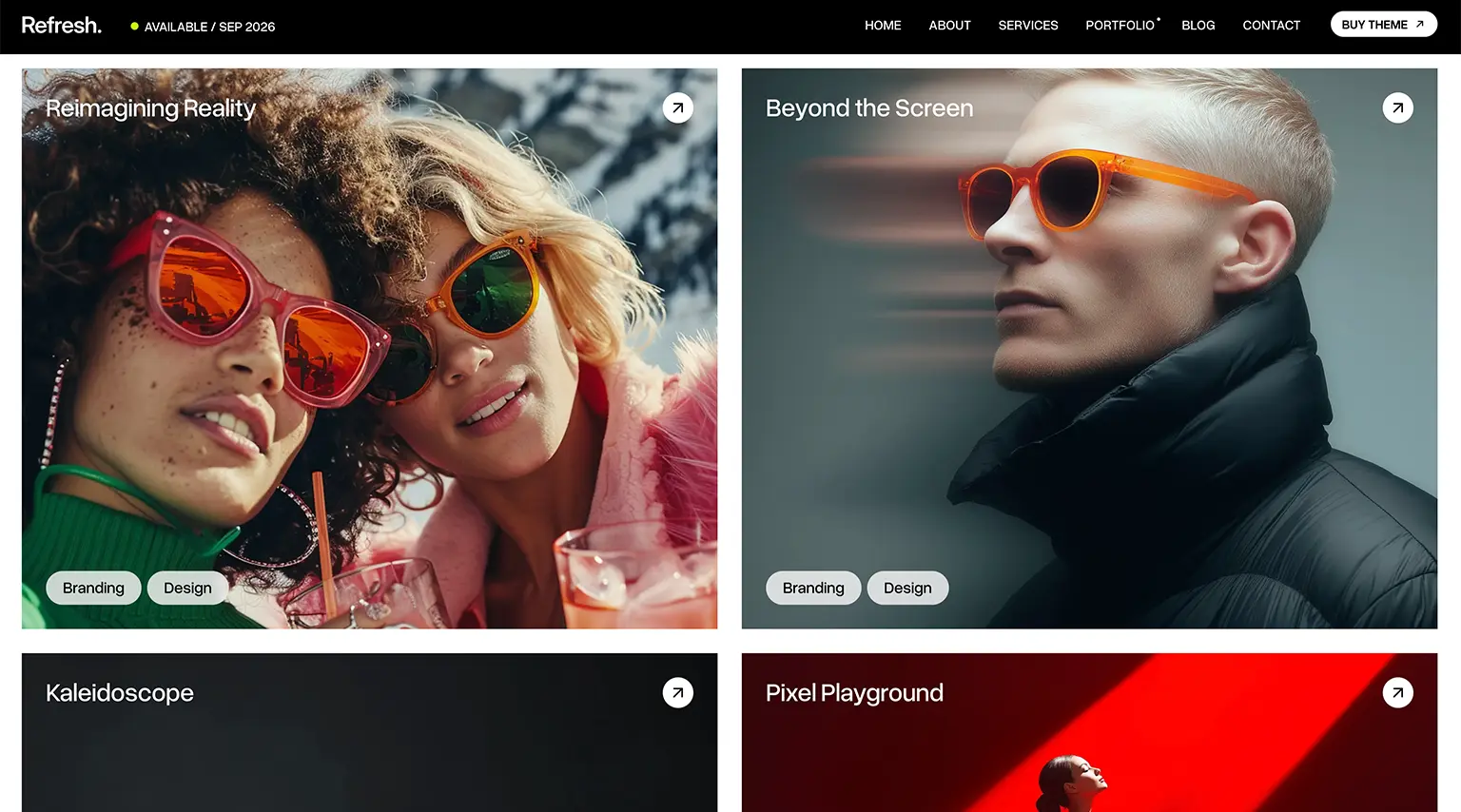
Six to twelve projects beat thirty. Filter by type only if you have enough items in each type. Each tile needs:
- A still that reads at phone width (UI close-up or a real environment, not a 12-column sitemap graphic)
- Client or project name
- One line of role (“Brand and site,” “Shopify rebuild”) — not a paragraph
Hover-only titles fail on mobile. Put the name on the tile. See Elementor mobile design mistakes.
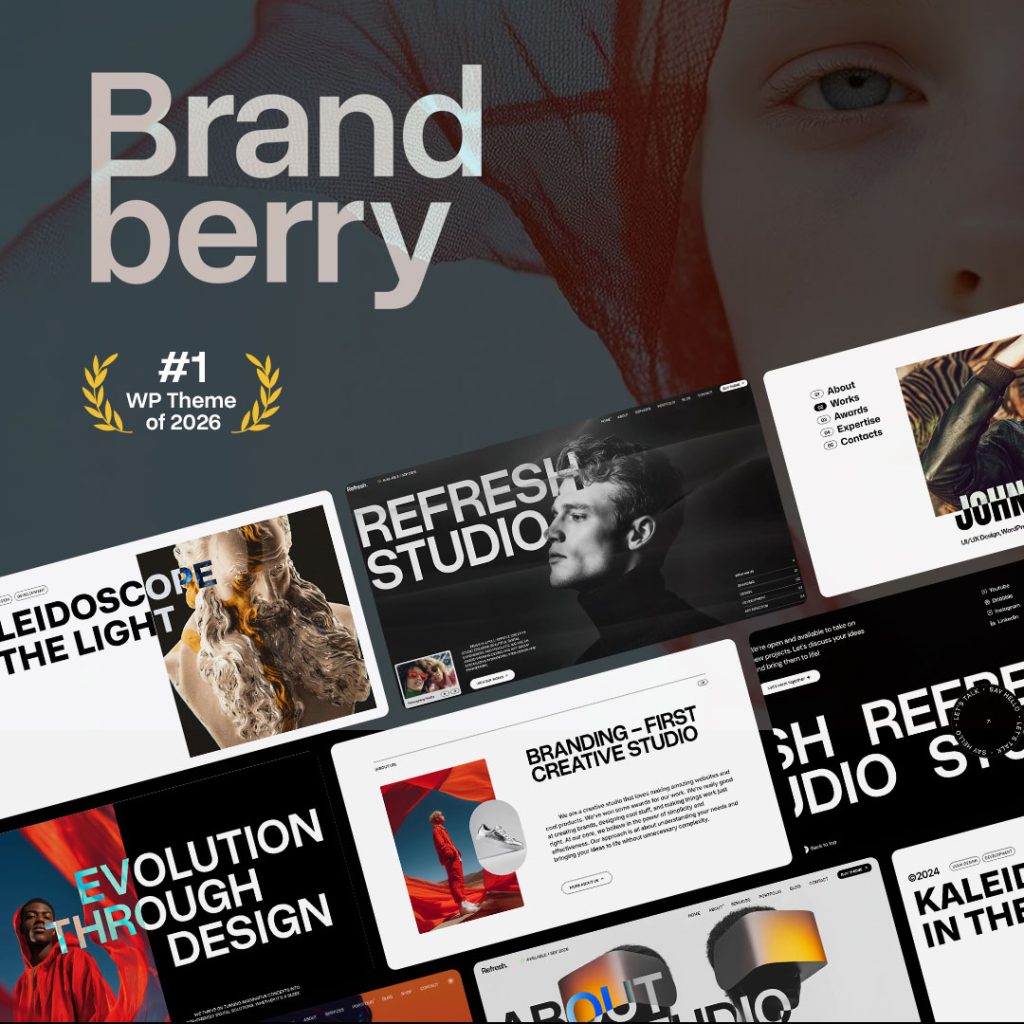
Themes such as Deep, Pine, and Brandberry already include portfolio grids. Use one grid style. Mixing three demo portfolios on one page is how the index looks like a catalog dump.
The case-study page: a spine, then pictures
Duplicate one template. Keep this order so the images have a job:
- Title + one-sentence outcome — what changed for the client, not “a beautiful website”
- Context — who they are, what was broken or missing
- Constraint — time, stack, brand rules, what you were not allowed to do
- Work — 3–7 wide images or short clips with captions that say what to notice
- Result — a metric if you have one, or a quote if you do not. Fake percentages belong in the bin.
- CTA — same as the rest of the site, not a new button style
Images inside the case study
Full-width frames are for the shots that prove the point (the shop grid, the before/after header, the packaging in use). Narrower images are for details. Do not make every screenshot full bleed; the page becomes a tunnel.
Caption the interesting ones. “Homepage” is not a caption. “Nav reduced to four items so the shop CTA could sit in the header” is.
Set a consistent content width in Site Settings so case studies do not each invent a new measure — Elementor global styles. New case-study templates should use containers, not a mix of old sections: containers vs sections.
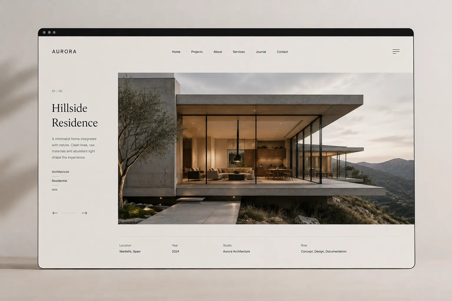
What to cut from demo portfolios
- Lorem project names and “Acme Corp”
- Password screens and “coming soon” tiles
- Filters with one item in each category
- A related-work carousel that repeats the same four thumbs
If you only have three real projects, show three. Empty-looking honesty beats a grid of placeholders. For a site that is mostly one offer, you may not need a separate Work index at all — see one-page vs multi-page.
Handoff
Give the client the duplicate-page path: new case study from the template, replace title, outcome, three images, CTA. Keep the header in Theme Builder so they cannot delete it from a project page. That is the same rule as making the site easy to edit.