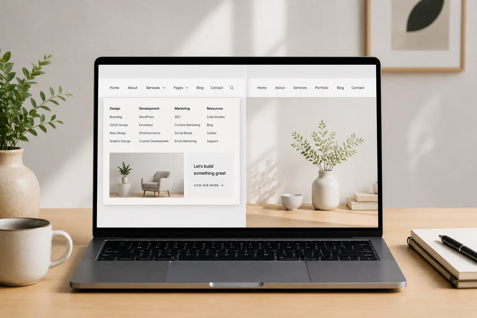
A mega menu looks impressive in a theme demo: six columns, featured work, icons, a promo tile. On a five-page brochure site it is slower to scan than a simple list. On a catalog or a multi-service agency it can save a click — or hide the one link people needed.
This article is when to use an Elementor mega menu versus a simple header nav. It is not a widget tour. Finish the real information architecture first; the menu only mirrors it. If you are still deciding one long homepage versus inner URLs, start with one-page vs multi-page Elementor.What a simple nav is for
Five to seven top-level items: Work, Services, About, Blog, Contact (or a single CTA). Dropdowns of two to eight links are still “simple” if they are text, not a second homepage.
Use this when the site is a story plus a few inner pages. Visitors can hold the whole map in their head. A mega panel adds hover precision, more HTML, and a mobile pattern you have to design twice.
What a mega menu is for
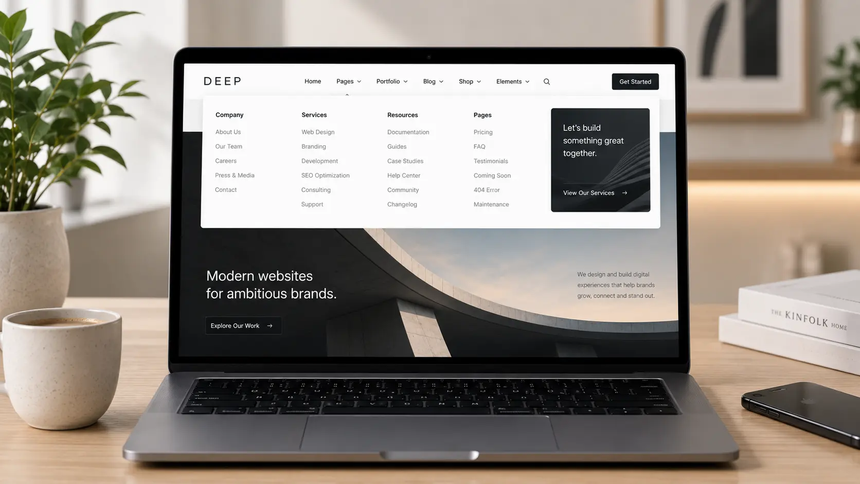
Use a mega menu when people arrive with a category already in mind: many services, many products, many locations, or a large resource library. The panel should show groups (Brand, Web, Retainer) not a flat dump of 40 URLs.
It also helps when you need a featured entry (a flagship product, a current campaign) beside the list — one image, one line, one link. Three featured tiles is a homepage, not a menu.
Elementor and theme menus
You can build a mega panel with Elementor (nested containers in a Theme Builder header, or a mega-menu widget). Premium Elementor themes — including Brandberry and Deep — often include a header nav that already supports dropdowns or a mega layout. Use the theme’s header template; do not drop a second menu widget on every page.
If sticky headers are on, test the open panel while stuck. A mega that opens behind content or off-screen is worse than a static simple nav. See sticky header in Elementor.
Mobile is the real design
Hover mega menus do not exist on phones. Plan an accordion: top-level, then groups, then links. If the mobile menu is a screenshot of the desktop mega, rewrite it. Tap targets and scroll lock matter more than the desktop animation — mobile design mistakes.
Do not hide important links on mobile “to keep it clean.” Hide decoration (the promo tile), not Contact or the main service group.
A simple rule
- Under ~8 real destinations: simple nav
- Clear groups of 4+ links each, used weekly by visitors: mega
- Unsure: ship simple, add a mega when the IA is proven, not on day one of a demo import
Keep globals on the panel (type, colors, button) so it does not look like a third theme. That setup is in Elementor global styles.
Do not decorate the nav to look “premium”
Icons on every item, background video in the panel, and a newsletter field inside the menu slow people down. A mega menu earns its keep by grouping links. If the groups are fake (four columns of lorem), delete the mega and put the five real pages in a simple bar. Customizing a theme demo includes cutting leftover chrome like this.