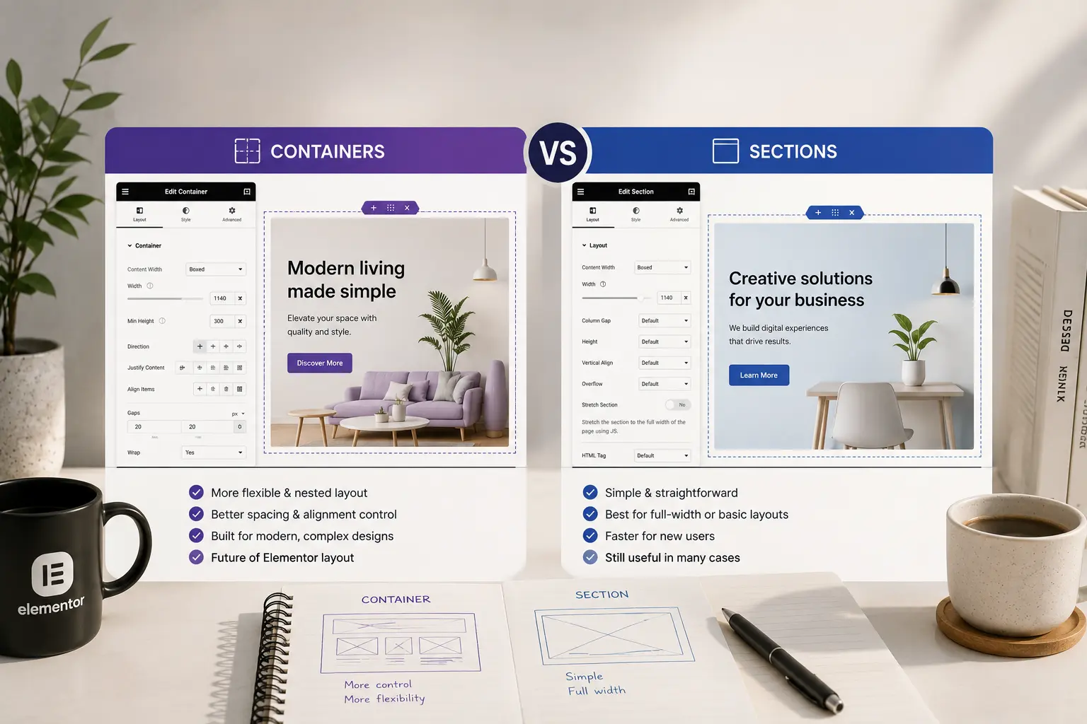
Elementor used to be sections, columns, and widgets. Newer sites are containers: Flexbox (and Grid) layouts that nest without the old column widget. Both still exist. Mixing them without a rule is how pages get a horizontal scrollbar on mobile and a Navigator nobody can read.
This article is a practical choice for new pages and for sites you still maintain. It is not a full Flexbox tutorial. If the site already looks uneven across breakpoints, check Elementor mobile design mistakes after you pick a layout model.
What changed
Sections and columns were a table-like grid: a section, up to 10 columns, widgets inside columns. Containers are CSS Flexbox (or Grid): one wrapper, direction, wrap, gap, alignment. You can nest containers instead of inventing extra sections.
Elementor has been pushing containers as the default for new installs. Older demos and many live sites still use sections. Neither is “wrong.” The wrong move is using both on the same page without noticing.
When to use containers
Use containers for new pages and new sites when:
- You need a row that wraps cleanly on tablet (cards that go 3 → 2 → 1)
- You want gap instead of padding hacks between widgets
- You are building a header or a hero with a left stack and a right media column
- The theme’s starter sites are already containers — common on current Elementor themes such as Brandberry, Deep, and Pine
Containers also make “easy for the client to edit” harder if you nest four levels. Keep the public pages shallow. See Elementor sites clients can edit.
When to leave sections in place
Do not convert a whole production site to containers “because 2026.” Convert when you are already rebuilding a template.
Leave sections when:
- The page is stable, converting would be a paid rebuild, and nothing is broken
- A third-party widget still expects a column parent (less common, but test)
- You are mid-project and the rest of the site is sections — finish in one model
A hybrid homepage (hero as container, rest as sections) is how you get two spacing systems and a messy mobile pass.
How to convert without wrecking the page
- Duplicate the page on staging. Never convert the live URL first.
- Convert one section at a time (Elementor’s convert control, or rebuild the block).
- Reset padding: section padding ≠ container padding. Check desktop and mobile.
- Replace “column width %” with flex grow / wrap / gap.
- Walk the page on a phone. Overflow almost always comes from a child with a fixed width or nowrap heading.
If the layout was tied to global width, keep that in Site Settings — Elementor global styles — so containers do not each invent a new content width.
Flex habits that prevent most bugs
- Set Direction and Wrap on purpose. Default row + nowrap is the sideways-scroll bug.
- Use Gap between items instead of margin on every widget.
- Align the stack (start/center/space-between) at the container, not with spacers.
- On mobile, switch direction to column when the row is not a true pair.
Performance is not the reason to convert
Containers are not a speed plugin. They can mean slightly less wrapper HTML than section + column, which is nice, not magic. Slow Elementor sites are still images, fonts, and extra scripts. Fix those with how to speed up an Elementor website rather than a full layout rewrite.
A rule you can actually follow
New site or new template: containers, nested as little as possible. Old site that works: leave sections until you rebuild that template. One model per page. If you are choosing Hello versus a designed theme, the theme’s demos already picked a model for you — Hello vs a premium Elementor theme — match it instead of mixing.