A contact page in Elementor is often a leftover demo: a map nobody uses, six fields the client will not answer, and a headline that says “Get in touch.” Inquiries stall because the page does not answer three questions: why write, what happens next, and who is on the other end.
This is a layout you can build once and reuse. It is not a CRM or email-deliverability guide. Pair it with Elementor global styles so the form button matches the rest of the site, and with a client-editable structure so they can change the office line without breaking the form.
What the page has to do
One job: make sending a message feel lower-risk than staying silent. That means a clear offer (“Project enquiry,” not “Hello”), a short form, and proof that a human reads it. Extra widgets (live chat, three social grids, a 12-field brief) compete with that job.
A layout that works on most marketing sites
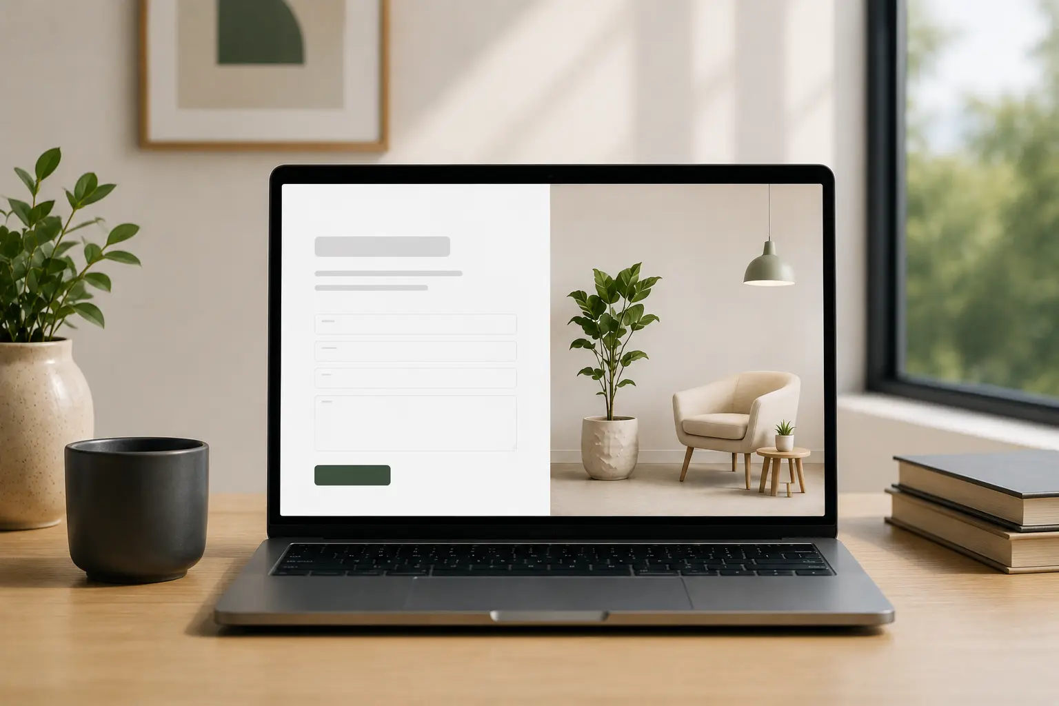
- H1 that names the next step — “Start a project” or “Book a 20-minute call,” not the word Contact alone.
- Two or three lines of context — who you help, typical response time, what to include (URL, budget range, deadline).
- The form — name, email, message. Add phone or budget only if you actually use them.
- A side column of trust — email, hours, one testimonial, or a face photo. Not a second form.
On mobile, stack trust under the form or above it — do not hide it. See Elementor mobile design mistakes if the submit button sits under a sticky bar.Form fields: fewer than you think
Every extra field is a reason to leave. Keep the first submit easy. If you need a full brief, link “Prefer a longer brief?” to a second page or a file upload after they send the first message.
Contact Form 7, native theme forms, or Elementor’s form widget can all work. Pick the one you already support. Do not add a second form plugin “just in case.” If you are choosing Theme Builder vs Elementor Pro for forms and popups, read whether you need Elementor Pro.
What to skip
- An embed map as the hero — it steals the first screen and rarely converts
- Hover-only “send” states that fail on phones
- A newsletter block that looks like the enquiry form
- Six office locations when there is one person answering mail
After submit
Show a thank-you state on the same page or a dedicated URL. Say when they will hear back. If the message goes to a shared inbox, say that. Silence after “Message sent” feels like a broken site.
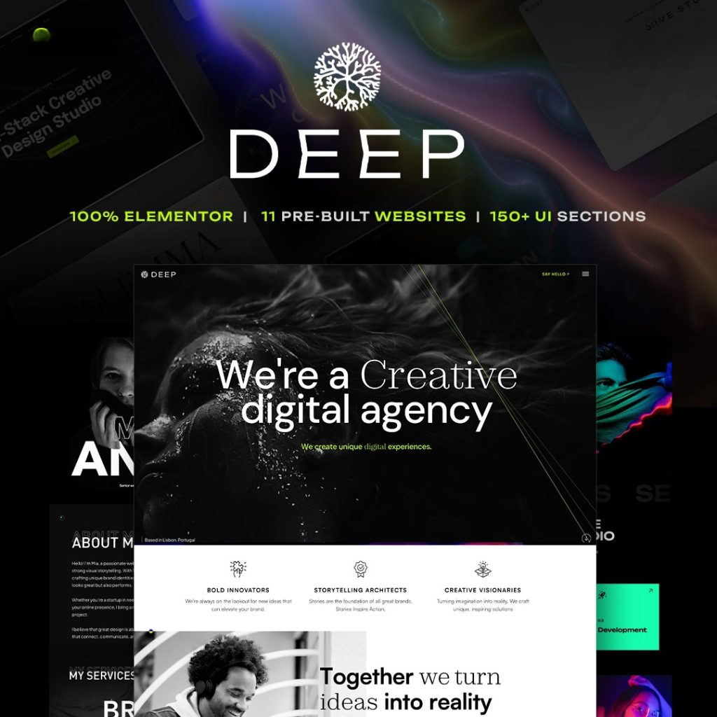
Designed Elementor themes such as Brandberry, Deep, and Pine already ship contact demos. Replace the dummy fields and the fake map; keep the column rhythm if it already matches the brand
A 10-minute QA
- Submit the form on a phone with a real email
- Confirm the notification arrives and the thank-you is readable
- Check the button contrast and tap size
- Read the H1 out loud — if it could sit on any demo, rewrite it
Then stop decorating. A contact page that is short, specific, and honest will outperform a long “studio culture” collage with a buried form. For the rest of launch, use the theme customization checklist.