

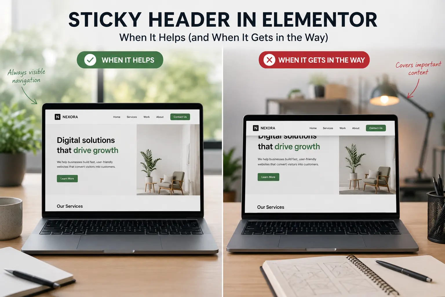
A sticky header keeps navigation on screen while the visitor scrolls. On a long landing page that can help. On a short brochure site, or on a phone with a tall bar, it can cover the first heading and make the page feel smaller than it is.
This article covers when an Elementor sticky header is worth it, how to set one up without fighting the theme, and the mobile checks that usually get skipped. It is not a plugin roundup. If you are still shaping the whole demo, start with customizing an Elementor theme demo so the header you stick is actually the client’s header.
When a sticky header helps
Use one when the page is long and the next action is in the nav or a persistent CTA: multi-section homepages, documentation-style service pages, shops where “Cart” should stay reachable.
It also helps when the header is compact: logo, a few links, one button. A slim bar can stay put without eating the viewport.
When it gets in the way
Skip or rethink sticky if:
- The header is tall (two rows, announcement bar, mega menu, extra icons)
- The first screen is a full-bleed hero and the stuck bar covers the headline on tablet
- You already have a sticky “Book a call” or cookie bar; stacked chrome is worse than no sticky nav
- Mobile menu is a full-screen overlay — the stuck bar plus overlay is easy to get wrong
Announcement bars plus sticky headers are a common pile-up. Pick one thing that stays on screen, or shrink both.
How sticky actually works in Elementor
Elementor can make a container or section sticky (Motion Effects / Sticky, often Pro). Many premium Elementor themes also include a header sticky option so you are not layering a second motion plugin.
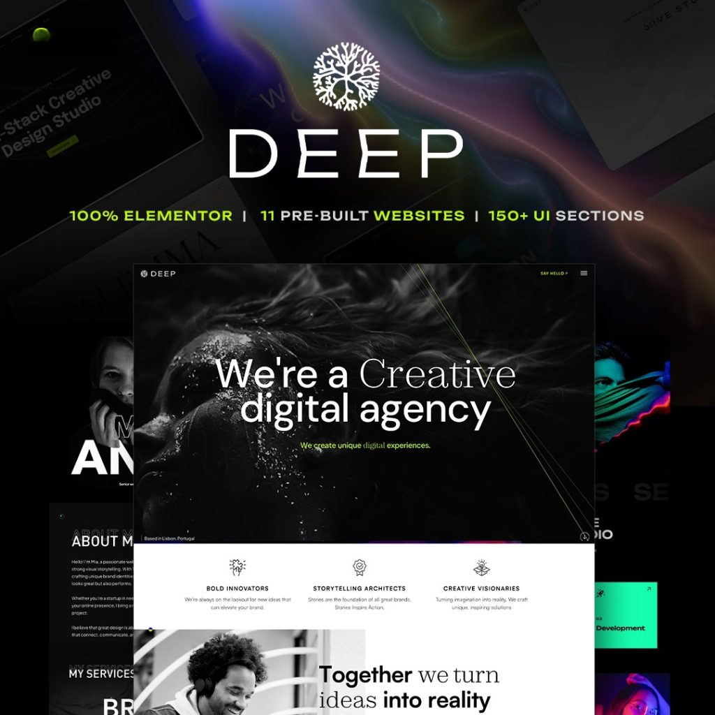
TreeThemes’ Elementor themes — including Brandberry and Deep — are built so the header is a Theme Builder template. Stick that template (or the theme’s header sticky control), not a duplicate header widget on every page. Two headers, one sticky, is how you get a jump on scroll.
If you are choosing Theme Builder vs Elementor Pro, whether you need Elementor Pro is the clearer fork. Do not enable sticky in two systems.
A setup that survives real content
- Finish the header layout first: logo size, menu, CTA, mobile breakpoint.
- Turn sticky on for desktop only if mobile is still messy. Many sites should stick from tablet up, not from 320px.
- Add a scrolled state if the theme supports it: smaller logo, solid background, thinner padding. A transparent header that stays transparent over body copy is unreadable.
- Offset the first section. Sticky bars cover hero headings unless the hero (or a spacer) accounts for header height. Test with the real logo, not a tiny demo mark.
- Check dropdowns and mega menus. A stuck header with a menu that opens behind content is worse than a static header.
Mobile: the checks that catch most failures
- Does the stuck bar cover the H1 after a short scroll?
- Can you still tap the hamburger with a thumb, not a cursor?
- If there is a phone CTA in the header, does it sit under a browser chrome or cookie notice?
- After opening the mobile menu, does scroll lock work, or does the page slide underneath?
If three of those fail, turn sticky off on mobile and keep it on desktop. That is a valid responsive choice, not a cop-out. Related spacing issues live in Elementor mobile design mistakes.
Performance and motion
Sticky itself is cheap. What is not cheap is a header that loads extra scripts, Lottie, or a background video “because it looks premium.” A stuck heavy header follows the visitor down every pixel. Keep the bar light: logo, nav, one button.
If the page already feels slow, fix images and scripts first — how to speed up an Elementor website — before you add another always-on UI layer.
A simple decision
Long page, short header, clear CTA in the bar: sticky is useful. Short page, tall header, or a hero that needs the full first screen: leave it static. Set it once in the Theme Builder header, test real content on a phone, and do not stack it with every other floating widget you own.

)