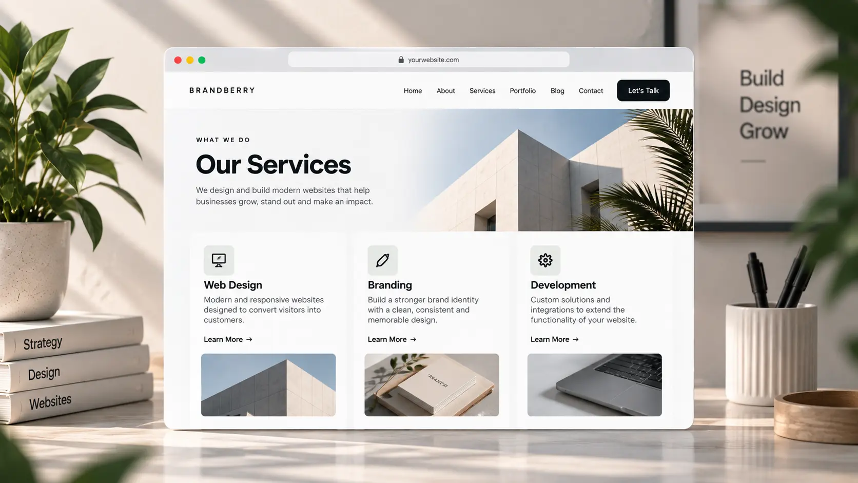
A services page that lists eight vague offerings—“branding, web, social, strategy”—helps nobody choose. Visitors who open it already believe you do work. They want to know what they can buy, what it includes, and where to enquire. Elementor makes it easy to turn that into a grid of icons. The grid is usually the problem.
This is a structure for an Elementor services page on a studio or freelancer site. It is not TreeThemes’ own setup and customization services; those are a different page. Pair this with the contact page so each service can point at one form.
Three offers beat eight icons
Name what you sell in the language the client uses. “Website on Elementor,” “Brand identity,” “Ongoing support” is clearer than “digital solutions.” Three is enough for most small studios. A fourth is fine if it is a real product (a shop setup, a retainer). Ten is a menu of maybe.
For each offer, write:
- Who it is for (one line)
- What is included (four bullets, not a brochure)
- What happens next (call, form, or a scoped quote)
Prices can sit here if they are real and current. If every project is custom, say so and give a starting range. Fake “from $99” on a $8,000 build trains the wrong enquiries.
Layout that stays editable
One column per offer, stacked on mobile, is easier to maintain than a hover card with a nested popup. Clients will change bullets; they should not have to hunt a flip-box. That is the same idea as making a site easy for clients to edit.
Link each offer to a short example on the portfolio page, not a gallery inside the card. Put process (brief → build → launch) once under the three offers, or on about. Repeating “how we work” on home, about, and services is how demos feel long.
Use global styles for headings and buttons so this page matches home. On Brandberry, Deep, or Pine, start from the closest services demo and delete unused icon boxes the same day you paste real copy.
FAQ belongs after the offers
Timeline, what you need from the client, and whether you work remotely—three answers, not twelve. If the list grows, it is its own page. Keep the last block a single CTA to contact. The footer can repeat the email; it should not repeat the full offer list.
On a phone, each offer should read without a hover. See mobile design mistakes if the enquire button sits under a sticky header. Have the copy ready and want the page built? Send the three offers and the theme you are on.