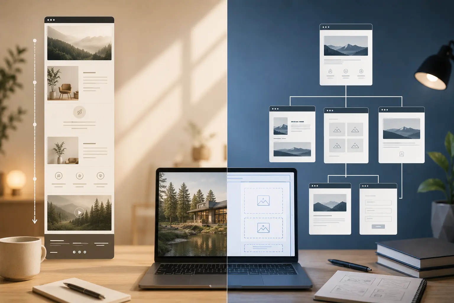
A one-page Elementor site puts every section on a single URL: hero, services, work, about, contact. A multi-page site splits those into Home, Work, About, Contact, maybe a blog. Both can look professional. They fail for different reasons.
This is a decision guide for marketing sites, portfolios, and small businesses — not a dogma piece. If you are still choosing the foundation, how to choose an Elementor WordPress theme matters more than the page count.
What a one-page site is good at
One page works when the story is short and the next step is obvious: a freelancer with six projects, a studio with three services, a launch landing page, an event.
Benefits:
- The visitor never hunts for Contact — it is at the bottom (or a sticky CTA)
- You design one layout system instead of ten inner pages
- Anchor links in the header replace a deep menu
It also forces honesty. If you cannot explain the offer in a handful of sections, a one-pager will feel like a brochure stuffed into a scroll.
Where one-pagers break
- SEO for multiple intents. “Web design Lisbon” and “brand identity packages” want different URLs and titles. One H1 cannot serve both well.
- Length. A 4,000px homepage with every case study is not “simple.” It is a slow scroll with no way to share a single project.
- Updates. Clients add a seventh service and a blog. The one-pager becomes a dumping ground.
- Sticky chrome. A stuck header plus a long page can cover headings — see sticky header in Elementor.
What a multi-page site is good at
Multi-page is the default for agencies, shops, and anyone with more than one offer worth its own URL. Each page can have a real title, a focused H1, and a CTA that matches that job.
It also matches how people share: “here is our pricing,” not “scroll to section 6.”
The cost is consistency. Inner pages need the same globals, header, and type scale as the homepage. That is why Elementor global styles come before you invent a new layout for every URL.
A simple way to choose
Build one page if all of these are true:
- One audience, one offer (or a tight bundle)
- Fewer than about six sections of real content
- No blog, no shop, no separate legal/resource library you care to rank
- The client will not add a new “pillar” every quarter
Build multi-page if any of these are true:
- Two or more services that a stranger would search for separately
- A portfolio that needs individual case-study URLs
- A blog, news, or resources section
- WooCommerce or a services catalog — see WooCommerce with Elementor
Hybrid: small multi-page, not a fake one-pager
A useful middle: Home (story + proof + CTA), Work (or Services), About, Contact, optional Blog. That is four to five templates, not a 12-page brochure and not a single endless scroll.
Demos from Pine, Deep, and Brandberry are usually this shape. Import one, delete pages you will not use, and do not flatten everything onto Home because the demo homepage looked complete.
Elementor specifics
One-pagers: name sections in Navigator, set header anchors that match IDs, and test mobile jump links. Hidden-on-mobile sections will skip in the menu and confuse people. Multi-page: duplicate a saved inner-page template so Contact does not look like a different product. For client editing after launch, keep structure shallow — make the Elementor site easy for clients to edit.
Decision in one line
Short story, one CTA, no extra URLs: one page. Multiple offers, projects, or articles you want found on their own: multi-page (or a small hybrid). Pick it before you import three demos and try to merge them into one scroll.