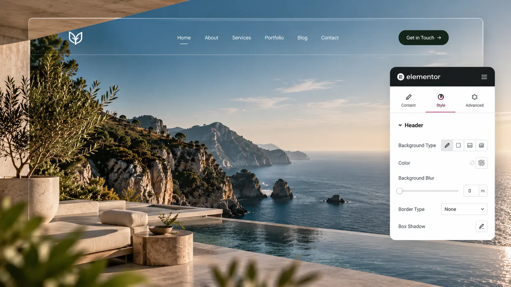
A transparent header looks finished in the demo: logo and links sit on the hero photo, then the bar turns solid as you scroll. On a real site it often fails in two places. Inner pages have no hero, so white type sits on a white background. Or the overlay never becomes solid, and the H1 slides under the nav. The effect is a homepage trick, not a site-wide style.
This is how to make a transparent header in Elementor without losing the logo. Build the bar first—Elementor header in Theme Builder—then decide whether it should stick. It is not a mega-menu tutorial.
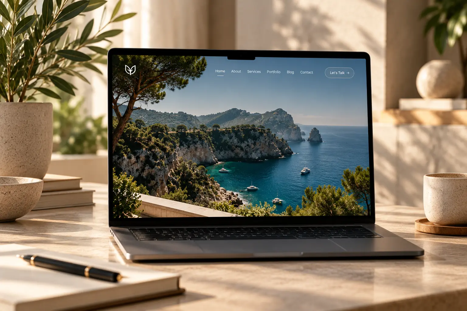
Overlay the homepage, not every URL
The header is still one Theme Builder template. Make the container background transparent (or a light scrim), position it over the first section, and give the hero enough top padding that the H1 is not under the logo. Light logo and links on a dark photo; dark logo on a pale photo. If the hero is a busy wedding grid, a 40% dark overlay behind the bar is more honest than hoping the files are dark enough.
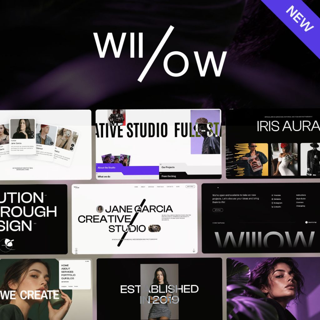
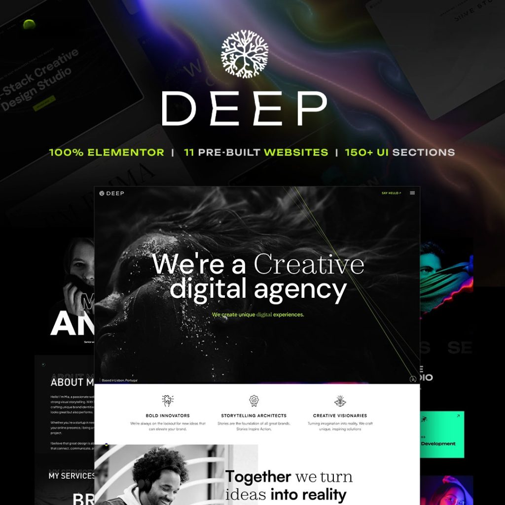
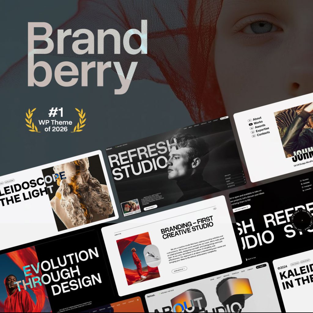
On Willows, Brandberry, Deep, and Pine, that header type already exists. Assign the transparent version to Home (and maybe a landing page). Assign a solid header to the rest of the site. One transparent header on Contact, Blog, and Checkout is how logos vanish. Two templates with clear display conditions is cheaper than a CSS exception on every inner page.
Scrolled state, then mobile
If the bar sticks, it must become solid after a short scroll: background, shadow or border, and often a smaller logo. A transparent bar that stays transparent over body copy is unreadable. Do not enable sticky in Elementor and again in the theme. Test the first screen with the real logo, not a 24px demo mark.
On a phone, overlay plus sticky plus an announcement bar is how the headline disappears—mobile design mistakes. Use a solid bar from the tablet breakpoint down if the hamburger sits on a pale sky. Off-canvas menus need a contrast that works without the hero behind them.
What to skip
A second header widget built on the homepage canvas “just for the overlay.” It will not follow you, and you will have two logos. Do not swap to a white SVG with a filter that never loads. If the brand mark is only dark, keep a solid header; a forced overlay is not a requirement. Pull type and the CTA button from global styles so the bar matches the rest of the chrome.
Need the homepage overlay and the inner header set once on a TreeThemes product? That is a short item on the services page, or send the live URL with which pages should sit on the photo.