Most Elementor sites look inconsistent for a boring reason. Colors and fonts were set on widgets, not in Site Settings. The homepage primary is one green. The services page uses a slightly different one. Headings jump size between templates. Buttons have three radii.
Elementor global styles exist to stop that. This is a practical setup order: colors, typography, buttons, then layout defaults. It is not a design-theory piece. If you just imported a demo, do this before you rewrite copy. The companion process for making a demo look like a brand is how to customize an Elementor theme demo.
What global styles actually control
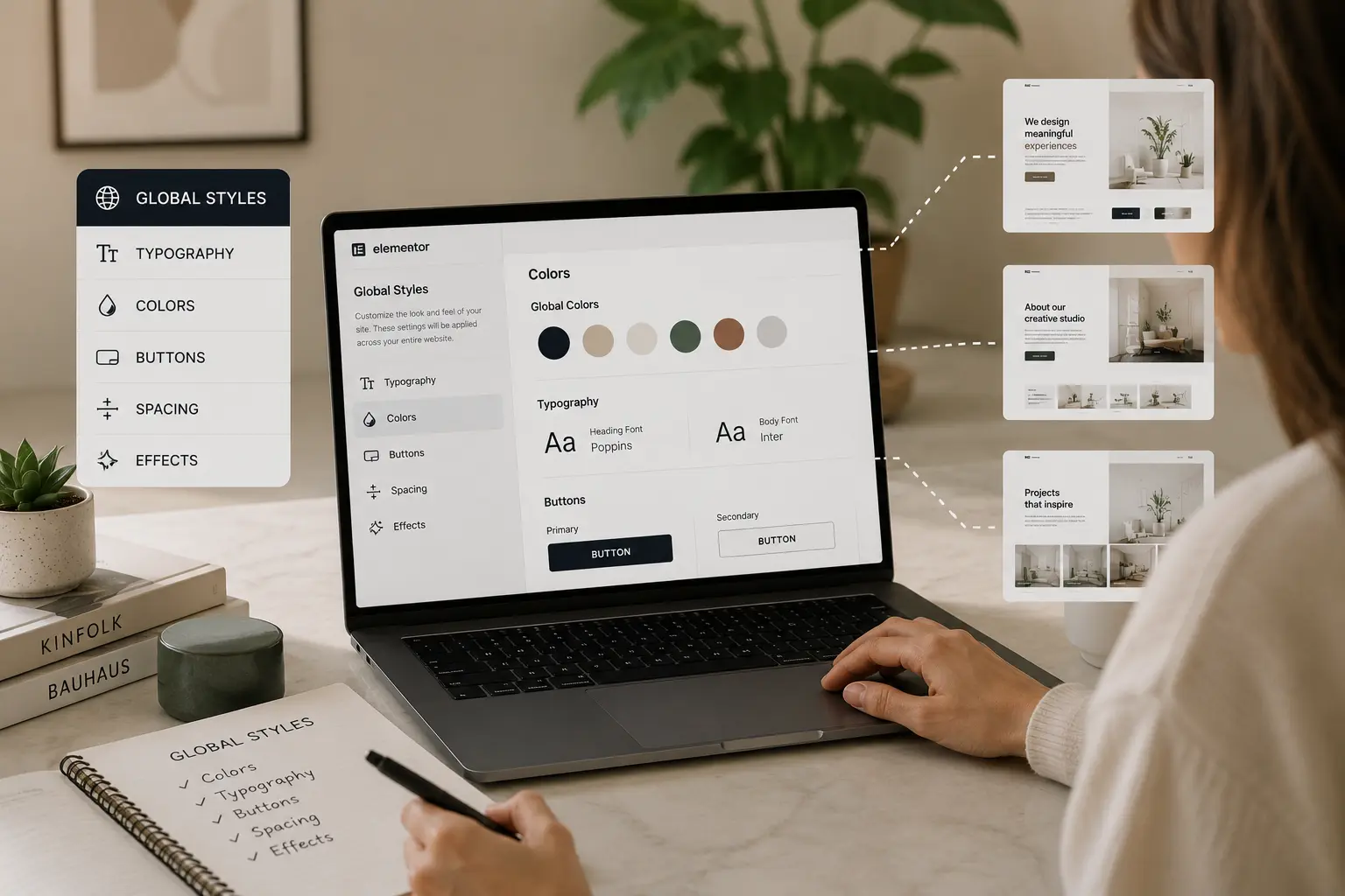
In Elementor, Site Settings (the hamburger in the editor, then Site Settings) holds the tokens the rest of the site should reuse:
- Global colors (primary, secondary, text, accent, plus extras you name)
- Global fonts for body, headings, and sometimes accent type
- Theme style buttons, form fields, and images
- Layout defaults: content width, gap, sometimes lightbox
Widgets can still override a token. The point is that the default path is the brand, not the last widget you styled.
Do this on staging, before inner pages
Change globals on a staging copy with the real logo and a few real paragraphs. If you restyle fifty sections first, then change primary color, you will spend an afternoon finding leftover hardcoded hex values.
A designed Elementor theme — Brandberry, Deep, or Pine — already maps most demo widgets to globals. That is the advantage over a blank canvas: you edit tokens once and the starter site moves with you. Hello-only builds only stay consistent if you were disciplined from the first section. See Hello vs a premium Elementor theme if that is still the fork.
Step 1 — Colors: four that matter, extras that earn their keep
Start with four:
- Primary — brand color for links, filled buttons, key UI
- Secondary — contrast for secondary buttons or highlights
- Text — body copy, not pure black unless the brand insists
- Background — page canvas, so sections can sit on a named token
Add named extras only when you will reuse them: a muted surface, a dark footer, an error red. Do not create “Green 2” because one hero felt dull. If a color appears once, it is a one-off, not a global.
Assign widgets to those tokens. If a heading is set to a custom hex, convert it to a global. That is the work that makes later brand tweaks cheap.
Step 2 — Fonts: two families, heading scale, body size
Two typefaces is enough for almost every marketing site: one for headings, one for body. A third is for a specific brand that already uses it.
Set:
- Body size and line height that survive 8–12 word paragraphs, not demo one-liners
- H1–H6 as a scale, not six unrelated sizes copied from different demos
- Font-display and subsetting later; do not load five weights you never use
Check the blog template and a long services page, not only the homepage. Homepage heroes hide a body size that is too small on inner pages.
Step 3 — Buttons once
Define filled and outline (or text) buttons in Theme Style: padding, radius, hover, typography. Then stop designing a new button on every CTA.
If the client has a “weird” campaign button, isolate it as a class or a one-off widget. Do not change the global to match a single landing page.
Step 4 — Layout defaults
Set a content width you will actually keep (often 1140–1280px for marketing sites). Pick a default section gap so you are not inventing padding on every container. Mobile will still need overrides; that is a separate pass — Elementor mobile design mistakes covers the usual failures.
When a widget should not use the global
Exceptions are fine: a dark footer on a light site, a one-time campaign color, a quote that needs a display face. Name the exception in the widget so the next editor does not “fix” it back to primary.
What is not fine is fifty undocumented exceptions. That is how globals become fiction.
A short check before you design the next page
- Primary/secondary/text/background match the brand, not the demo
- Headings and body use global fonts
- Buttons match Theme Style on homepage and contact
- No leftover demo palette on the header or footer
Then design. For the rest of launch hygiene, use the theme customization checklist.