Importing an Elementor theme demo is the easy part. The site looks finished in twenty minutes. Then the client’s logo goes in, the first real paragraph is shorter than the demo copy, and the homepage still reads like a template: stock photography, identical section rhythm, demo services, and a footer that still mentions someone else’s studio.
This is a practical process to customize an Elementor theme demo so it looks like the brand, not the starter site. It is not a launch QA list. For that, use the theme customization checklist before launch. This article is the work that happens between import and “this could be any demo.”
Why demos look generic after you “customize”
Most people change the logo and the hero headline, then stop. The demo still owns:
- Global colors and fonts
- Button radius, shadows, and hover
- Section padding and the same three-column rhythm on every page
- Placeholder projects, testimonials, and logos
- Header layout that was designed for the demo’s menu, not yours
Visitors do not notice “Elementor.” They notice that the photography, spacing, and type all came from the same shop. The fix is order: globals first, chrome second, content third, then delete what the brand does not need.
Work on staging, from one demo
Import on staging, not production. Pick one starter site that is closest to the real job — agency, portfolio, shop — and ignore the rest of the catalog until that one looks like the client. Mixing three demos on one install is how you get three headers and no system.
If you are still choosing the starter, how to choose an Elementor WordPress theme is the better first read. Demo personality matters more than the homepage animation.
Step 1 — Lock the design tokens
Open Elementor Site Settings (or the theme’s global styles) before you rewrite a single section.
- Primary, secondary, text, and background colors from the brand, not the demo palette
- Two typefaces maximum unless the brand already uses more
- Button style once: fill, outline, hover, radius
- Default section width and vertical padding
If you skip this, you will restyle every widget by hand and the inner pages will still look like the demo. Tokens are the difference between a theme and a design system. Agencies that reuse this step across clients should keep it in the demo-to-handoff workflow.
Step 2 — Rebuild the chrome, not the hero first
Header, footer, and mobile menu do more for “this is our site” than a new headline. Replace:
- Logo (light and dark if the header changes over a video or dark hero)
- Menu labels that match how the business actually sells, not “Home / Pages / Shop”
- The header CTA: one action, real destination
- Footer: real address, legal pages, and socials. Delete demo newsletter blocks you will not run
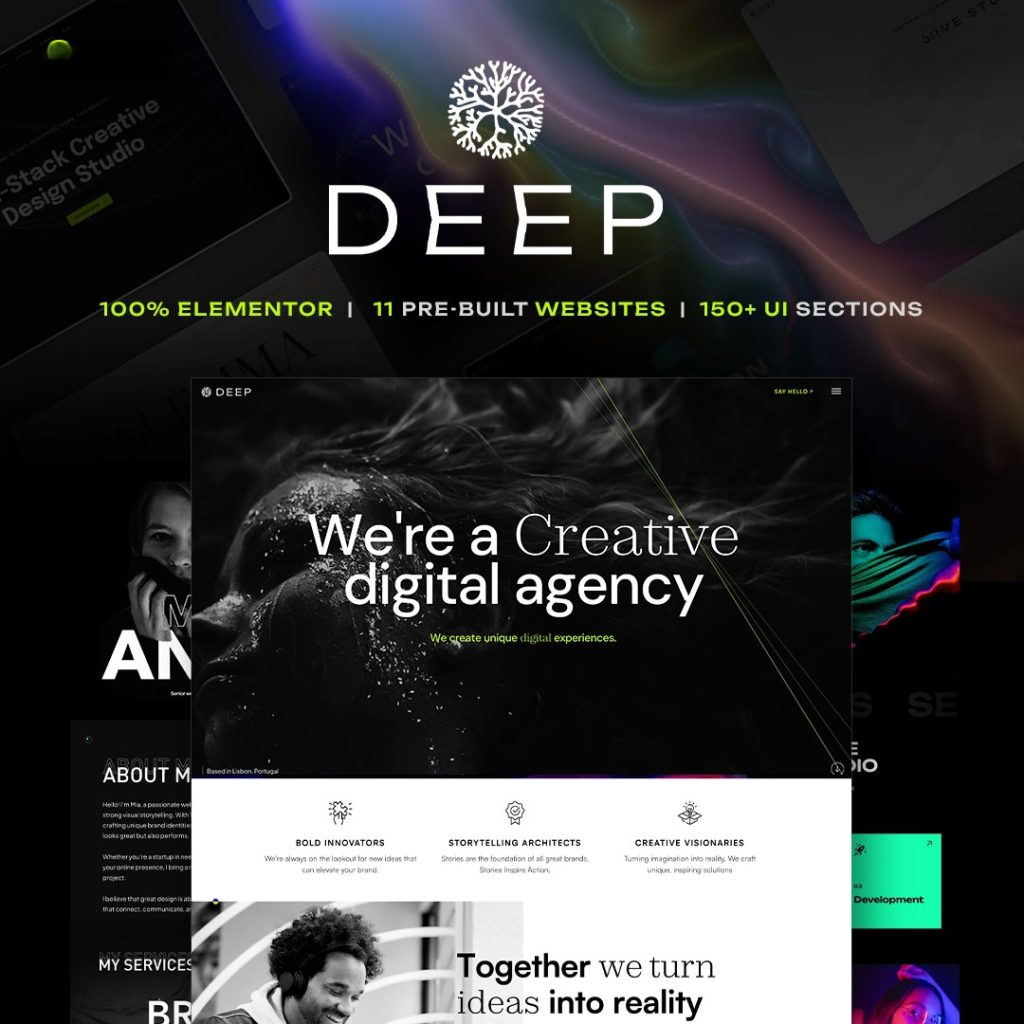
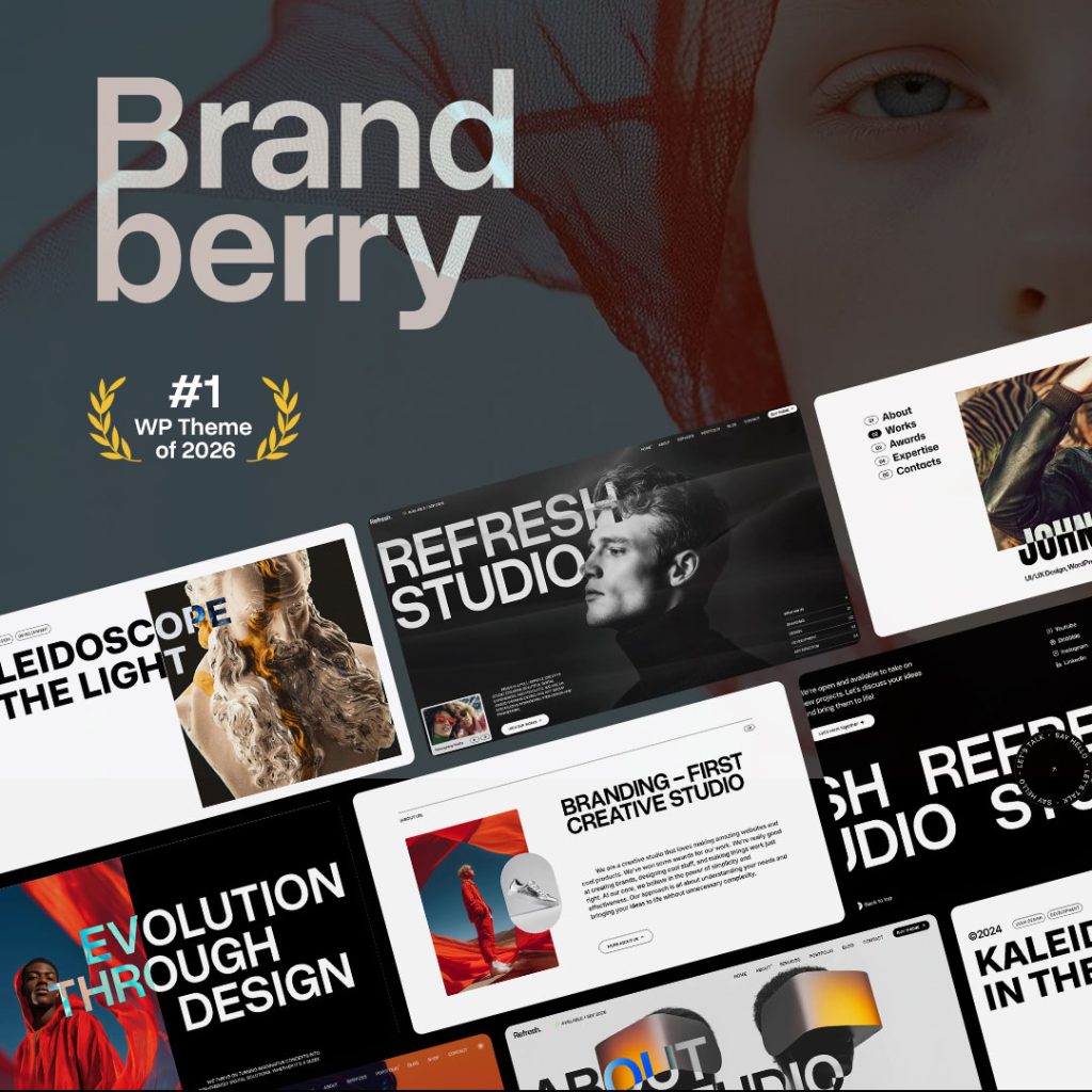
If the theme has a Theme Builder, edit those templates once. Do not restyle the header on every page. Premium Elementor themes such as Brandberry, Deep, and Pine are built around that: one header template, many pages.
Step 3 — Replace proof before decoration
Demo testimonials, client logos, and case-study titles are the fastest way to look fake. Either put real proof in, or remove the section until you have it.
Same rule for portfolios: three honest projects beat twelve demo tiles. Crop and compress the real images to the size they display. A demo that looked fast with optimized stock can stall on a 4000px phone photo. That is an LCP problem, not a “theme” problem — see how to speed up an Elementor website.
Step 4 — Rewrite for the offer, then delete leftover sections
Change the homepage from “we are a creative agency” to the actual outcome: who it is for, what you ship, what happens after the main CTA. Then walk every inner page and delete sections that only existed to show the theme’s widgets: extra sliders, duplicate CTA bands, a second testimonials row, a video that is not yours.
A customized demo is usually shorter than the import. That is a good sign.
Step 5 — Break the demo rhythm on purpose
Starter sites repeat a pattern: full-width hero, three icons, two-column image/text, logos, testimonials, CTA. After globals and copy are right, change at least two of those moves so the layout is not recognizable as that demo: different column split, a static image instead of a slider, a simpler services list, less motion on inner pages.
Do not add a custom cursor, Lottie, and a new slider on the same pass. One distinctive move is enough. Motion is optional; brand is not.
What you should not do
- Customize on the live domain while the demo is still indexed
- Leave “Lorem” or demo team names in the footer or schema
- Keep every imported page “in case.” Draft or delete unused demos so they never rank
- Install extra Elementor addons to restyle what global styles already control
- Call the site unique while the photography is still the demo pack
A short pass you can reuse
- Staging import, one demo
- Globals: color, type, buttons, spacing
- Header, footer, mobile menu, one real CTA
- Real images and proof, or remove the section
- Rewrite the offer; delete leftover demo sections
- Change two layout habits so it is not the starter
- Then run the launch checklist
Final thoughts
Customizing an Elementor theme demo is not “change the colors.” It is replacing the demo’s system with the brand’s system, then cutting everything that only existed to sell the theme. Hello plus a blank canvas avoids this job and creates a different one: you invent the system yourself. A premium demo is faster only if you actually finish this sequence. That tradeoff is the point of Hello Elementor vs a premium Elementor theme.
If you want designed starters to run this process on, import one demo from the premium WordPress themes catalog on staging, then work the list above before anyone sees production.