Your portfolio site has one job: turn strangers into conversations. Most freelancers optimize for taste. Buyers optimize for risk reduction. Those goals only overlap when the site is clear, fast, and specific about who you help.
Mistake 1 — Infinite galleries, zero narrative
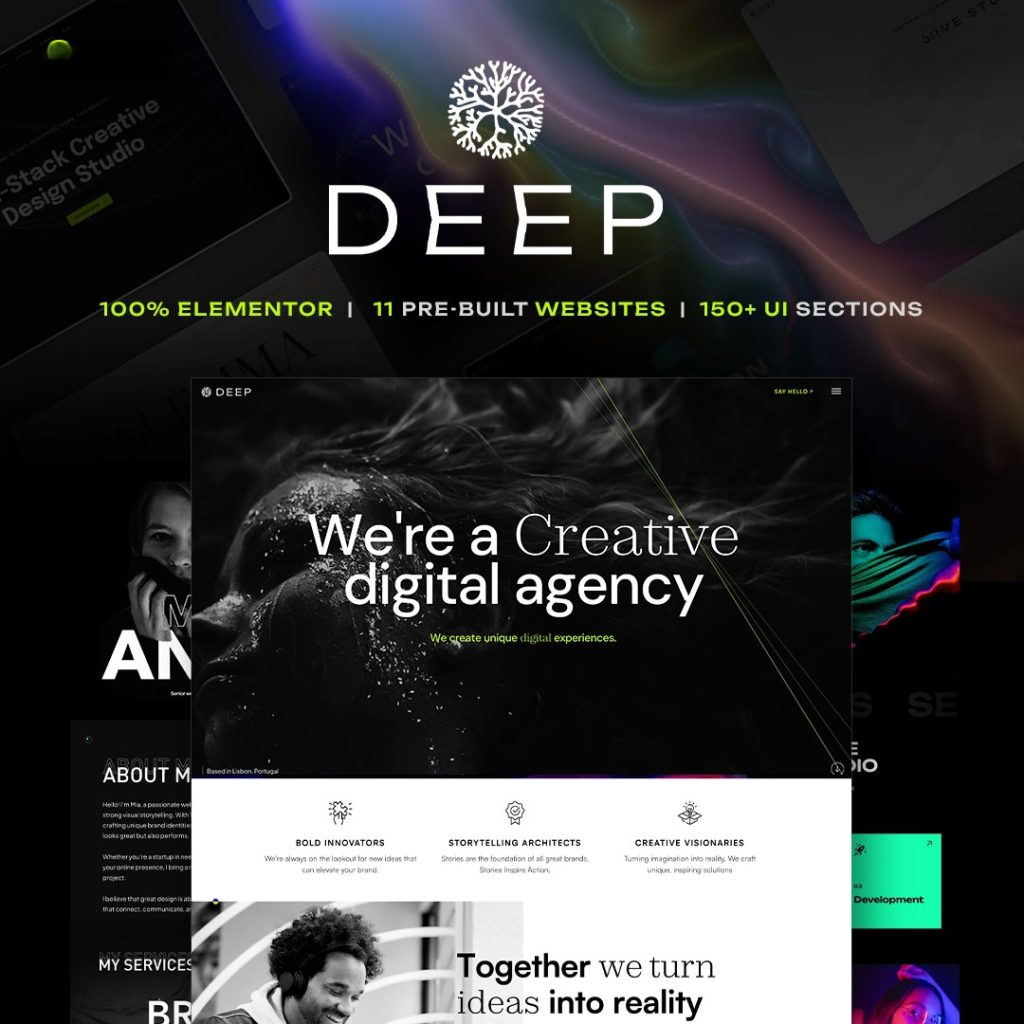
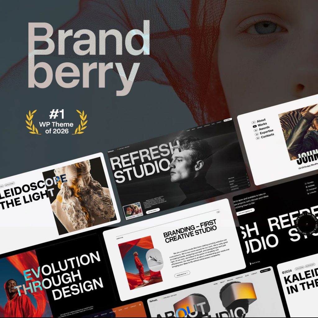
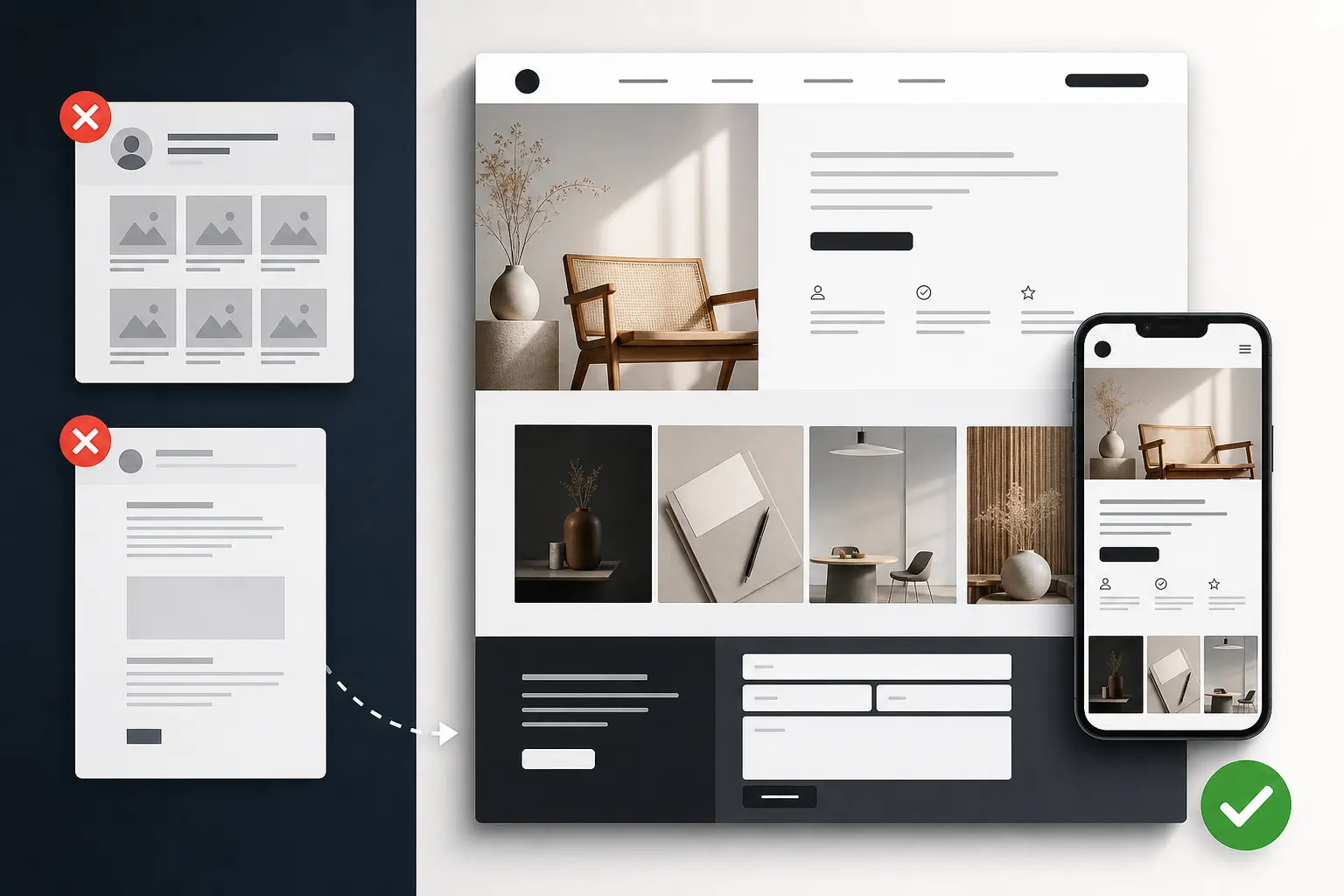
Twelve similar screenshots without problem, approach, and outcome do not help. Feature fewer projects with sharper stories. Let themes like Resonance or Deep frame case studies, not just mosaics.
Mistake 2 — Hiding the offer
If someone has to hunt for what you sell, they will bounce. Put services, starting points, and a primary CTA above the fold. “Available for select projects” is fine—as long as contact is obvious and mobile-friendly.
Mistake 3 — Demo content left behind
Nothing kills trust like placeholder client names. Replace every demo string before soft launch. Buyers notice unfinished details even when designers pretend they do not.
Mistake 4 — Motion without purpose
Animation can signal craft. It can also delay LCP and distract from the CTA. Use motion to guide attention, not to prove you found a toggle in the builder.
A conversion-minded structure
Use a simple sequence: hero with who you help and CTA; proof with logos and testimonials; selected work with three to six case studies; process; services and fit; contact with a low-friction form. Everything else is optional.
Technical trust
Fast mobile load, working form, HTTPS, and no broken demo links matter. So do caching rules that do not break forms. Buyers and ranking systems both notice reliability.
Proof that reduces buyer fear
Buyers fear hiring the wrong person more than they fear paying a fair rate. Reduce fear with specifics: industries served, project shapes, timelines, and collaboration style. A short “who I am not for” section can increase conversion by filtering mismatches early.
Testimonials work better with context—what was delivered and what changed—than with adjectives alone. Pair quotes with project thumbnails when possible.
Make contact low-friction: one primary form, clear expectations for response time, and an alternate email. Do not bury contact behind three portfolio filters and a modal that fails on mobile Safari.
Next steps
Building this week? Start from a portfolio-ready theme in our catalog, then strip anything that does not support the inquiry path.
How TreeThemes thinks about this
We build and support premium WordPress themes for people who ship real client work—not disposable demos. That means we care about licensing clarity, Elementor workflows, and practical performance as much as visual polish. When you use our catalog, you are choosing a product line meant to survive revisions, handoffs, and the messy middle of real projects.
If you want a second pair of eyes on your stack—theme choice, setup, or customization—reach out. We would rather help you pick once than watch a rebuild become inevitable.
Pricing pages and soft CTAs
You do not need public prices to convert, but you do need clarity. “Projects typically start at…” or “Book a fit call” beats mystery. If you use packages, describe deliverables and timelines, not just adjectives.
Secondary CTAs can capture browsers who are not ready: newsletter, case study PDF, or a short guide. Keep the primary CTA visually dominant so the page still has a clear job.
After launch, review analytics monthly: which case studies earn clicks, where sessions drop, whether mobile contact completions lag. Portfolio sites are products—iterate them like products, not museum pieces.
Content cadence after the portfolio launches
A portfolio that never changes becomes invisible. Add a new case study when you finish meaningful work. Refresh the hero offer seasonally. Publish short process posts if you want organic reach.
Do not let the blog compete with the inquiry CTA. Supporting articles should funnel back to contact. The site remains a sales asset first.
If you use a TreeThemes portfolio theme, keep global styles strict so new case studies inherit consistency. Consistency reads as seniority. Random one-off styling reads as hobbyist—even when the work itself is excellent.
Key takeaways
- Decide with constraints first: audience, builder, timeline, and commercial model.
- Prefer maintainable systems over one-off demo magic that only looks good on day one.
- Protect conversion paths—forms, cart, checkout—whenever you optimize for speed.
- Document licenses, templates, and edit rules so handoffs do not become support debt.
- Use TreeThemes products and services as leverage: the right theme personality plus clear process beats endless redesign cycles.
If you apply even half of the practices in this article on your next launch, you will spend less time fighting tools and more time shipping work clients can grow into. That is the standard we aim for across the TreeThemes catalog.
A closing note for busy teams
You do not need a perfect process to benefit. Start with one checklist, one staging habit, or one clearer CTA. Compound those wins across projects. TreeThemes exists to make the product layer of that journey more dependable—so your craft can stay on strategy, content, and client outcomes.